
In a time when responsive themes are the standard, one would be forgiven for wondering why a plugin is needed to make your WordPress site mobile friendly. The answer is simple: WordPress has been around since 2003, meaning that owners of some older generation websites are looking for a way to produce a mobile friendly version of their battle tested website.
Enter WPtouch – a WordPress plugin that automatically generates a simple (and customizable) mobile theme for mobile visitors, all while leaving your existing desktop WordPress theme intact. It offers a simple solution to accommodating the vast number of people browsing the internet via mobile devices.

In this article, we will guide you through the process of how to make your WordPress site mobile friendly with WPtouch. But before that, let’s explore why choosing a responsive theme – instead of using WPtouch – could be a better alternative:
Why you should consider a responsive theme instead of WPtouch
These days, the best way to make your WordPress website mobile friendly is by using a fully responsive theme.
The clear benefit in doing so (as opposed to using WPtouch) lies in the fact that no further action is needed to produce responsive content. If your theme is responsive, your website is responsive. As such, there is no need to install an extra plugin such as WPtouch.
Furthermore, the main issue in using WPtouch is that it produces a generic theme for your site when viewed on mobile devices, which may look drastically different to your existing WordPress theme. From a branding perspective, this is far from ideal. On the other hand, if you opt for a responsive theme, you will achieve design consistency across all devices – both desktop and mobile.
To make matters even simpler, any self-respecting modern WordPress theme is fully responsive out of the box.

All of our themes, including IsleMag above, are fully responsive.
We’re not saying that WPtouch is redundant, otherwise we wouldn’t be writing this article. However, we do consider the use of a fully responsive theme as the optimal solution, if you can make it work for you. If not, let’s crack on with our guide to making your website mobile friendly with WPtouch!
How to make your WordPress site mobile friendly with WPtouch
The beauty of WPtouch lies in its simplicity. After you install and activate it from the WordPress plugin repository, you’ll notice that it immediately gives you a new mobile theme, making it the easiest way to make your WordPress site mobile friendly. Below are examples of how WPtouch renders three key sections of any given blog, posts/pages, the homepage, and comments:

Impressively, no further configuration is required once the plugin is installed and activated. However, for the sake of design consistency, we recommend you apply some basic modifications to ensure your new mobile site more closely resembles your desktop site.
To do that, head over to the WPtouch icon from the WordPress dashboard:

You will be presented with the rather comprehensive WPtouch settings dashboard:
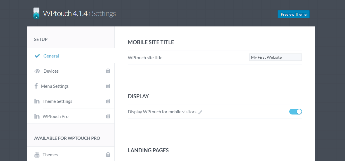
To adjust the appearance of your new mobile friendly theme, click Theme Settings on the sidebar, and WPtouch will give you a long list of theme configuration options. Let’s drill down to the ones that impact the appearance of your mobile theme most.
Firstly, you’ll notice that you can upload a custom logo to be displayed on mobile devices. Furthermore, you can include a search bar in the header, and choose which side to display the menu button on:

Further down that same page, you will find Theme Colors. As you might expect, this interface enables you to customize the colors used by WPtouch. We recommend you select a color scheme that matches your main design.
You can also choose between a number of different fonts. We once again suggest that you select a font that resembles the font on your desktop website:

Finally, towards the bottom of the page, you will come across some options pertaining to the presentation of your blog posts:

You can choose to display thumbnails, tags, post dates, and the number of comments that each post has received.
Optional step: consider WPtouch themes for improved design consistency
If the default WPtouch theme doesn’t complement the design of your desktop website as much as you would like, you might consider purchasing one of WPtouch’s seven premium themes, available from $35, to make your WordPress site mobile friendly in a more unique way.
To access those themes, click Themes on the WPtouch dashboard sidebar:
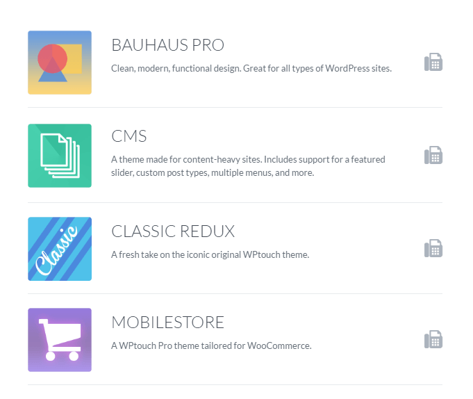
From there, you can browse through their selection. By clicking on any of the available themes, WPtouch will present screenshots and further details. To go to the purchase page, click Learn More:

Conclusion
With over 80% of internet users owning a smartphone, there is no doubting the importance of having a mobile friendly website. Ignoring mobile device users could spell disaster for your website, as they expect mobile friendly experiences and have little patience for websites that are difficult to navigate.
To ensure that your website is accommodating to all screen sizes, be sure to pick one of the following options:
- Option a) Start afresh with a responsive theme (we would of course recommend one of ours).
- Option b) Install and customize the WPtouch plugin to mimic your desktop website.
Are you tempted by the WPtouch plugin, or are you a responsive theme fan? Let us know how you prefer to make your WordPress site mobile friendly in the comments section below!


WPtouch has been a life saver for my blog! The only thing is, it cuts the content of my posts off when on mobile devices, and I don’t know how to fix this! Any suggestions?
Or start the conversation in our Facebook group for WordPress professionals. Find answers, share tips, and get help from other WordPress experts. Join now (it’s free)!