
Data visualization tools are highly useful for any task that involves showcasing big volumes of data. These tools transform a whole jumble of facts and figures into a neat picture that tells a bigger story. They facilitate faster decision making and can improve your marketing efforts if you’re an organization looking for better understanding of key data points.
While choosing from among the best data visualization tools, it helps greatly to know what capabilities you’re looking for in these tools. In general, check for:
- The extent of detail required in the visuals
- The types of data it supports and lets you manage
- The sources of data and the connection it establishes with the source
- Capacity to drill down into any data source
- Search using natural language
- Allows remote teams to collaborate
- Includes interactive visuals and neat dashboards
- Adds a wow factor to your visual representations
Let’s dive in!
Best data visualization tools in 2023
Now that we’ve talked about the possibilities available with data visualization tools, let’s look at what the market has to offer.
1. Google Charts
Google Charts is a completely free tool that offers a number of default models to visualize data. At the same time, you can customize these models in countless ways. It uses HTML5/SVG technology to provide cross-browser and cross-platform compatibility. Hence, it can be used on both Android and iOS devices without the help of any plugins or other software.
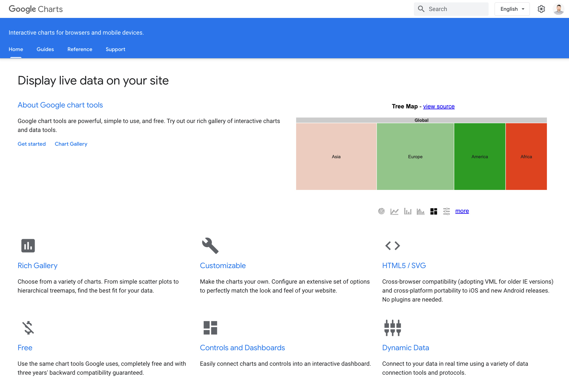
⚙️ Features:
- A Chart Gallery with a number of ready-to-use charts
- It’s easy to switch between chart types. Thus, you can experiment extensively before choosing your layout
- Allows access to data from most data sources, including third-party data providers
- Connects to data in real time using data connection tools and protocols
- Charts are highly interactive, can use animations, and be connected to an interactive dashboard
- Easy to embed the chart on your web page using JavaScript
💵 Pricing: Free.
2. Tableau
Tableau is an enterprise-level data analytics platform that can drill into different kinds of data to make sense of them. You get to work with an intuitive UI and view the dashboard on different screen sizes.
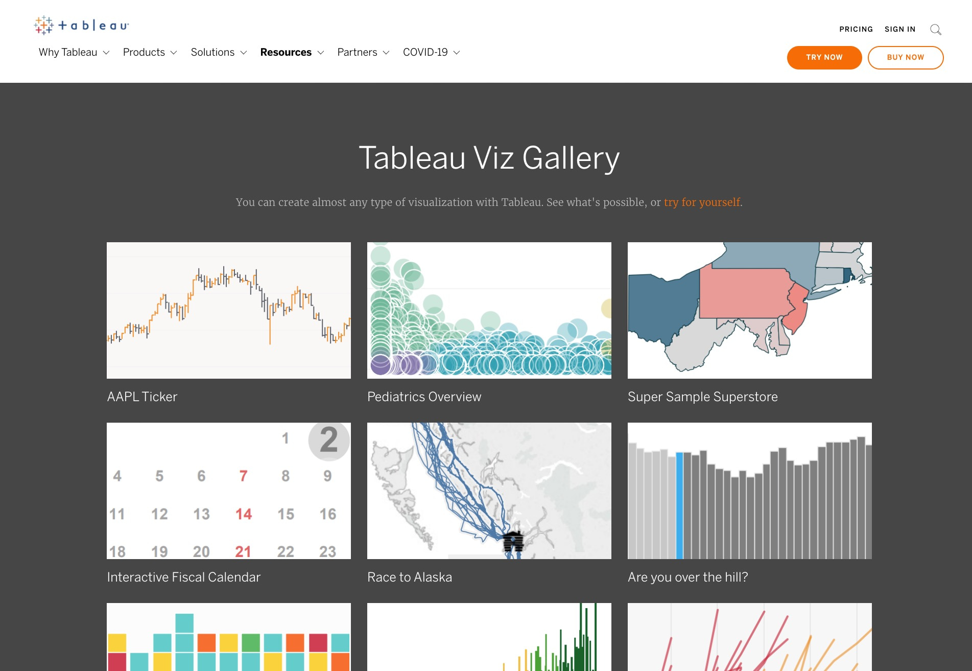
⚙️ Features:
- Comes with built-in visual best practices
- Allows to create or analyze a dashboard, even while in discovery mode
- Connects with existing data infrastructure, whether on premises or in the cloud
- One integrated platform for data access, prep, analysis, collaboration, and governance
- Proprietary technology to help users explore data graphically
- Customized visualizations using a simple calculation language
- Toggle between in-memory and live connections with a click
💵 Pricing: Three packages are available – Explorer: $35 user/month; Viewer: $12 user/month; Creator: $70 user/month.
Viewers can interact with data and collaborate with teams while Explorers can create visualizations. Creator is intended for power users, and they have full author/edit privileges. You can switch between plans easily, and there’s a free trial, too. The software can be installed on premises or in the cloud. Rates are higher if hosted on a Tableau server.
3. FusionCharts
FusionCharts offers a clean and dynamic way of displaying information on your website. In a few minutes, you can put up your first chart without having to go through a learning curve. It boasts a wide user base and counts tech majors, like Apple and Adobe, among its users.
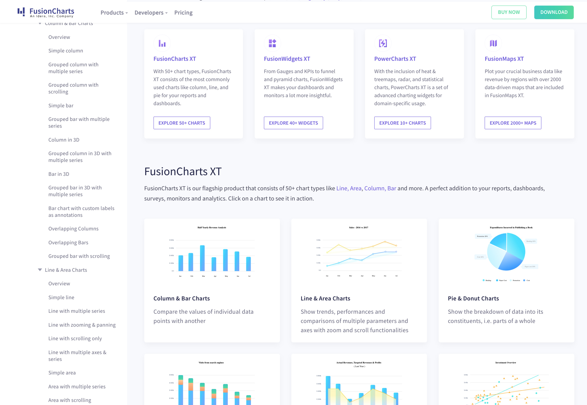
⚙️ Features:
- Consistent API across different charts for easy chart building and dashboard construction
- 100+ interactive charts, and 2,000+ data driven maps
- Different themes ensure a consistent look across charts. Plus, you can build your own theme
- Ready-to-use chart examples and industry specific dashboards
- Powerful time series charts for large data to render even a million data points in the browser
- Dashboards can be easily exported as PDFs
💵 Pricing:Annual and Perpetual plans are available as Basic, Pro, and Enterprise packages at $1,299, $3,499, and $6,499, respectively. The Basic plan will suffice for a small internal app or website dashboard and allows a single developer to use it.
4. Datawrapper
If you’re looking to add interactive visualizations to your web pages, Datawrapper is a good choice. Almost anyone can create charts, tables, graphs, and more, without possessing any software or design skills. All it takes is to choose from among the many chart types, input your data, edit the chart, and embed it wherever you want.
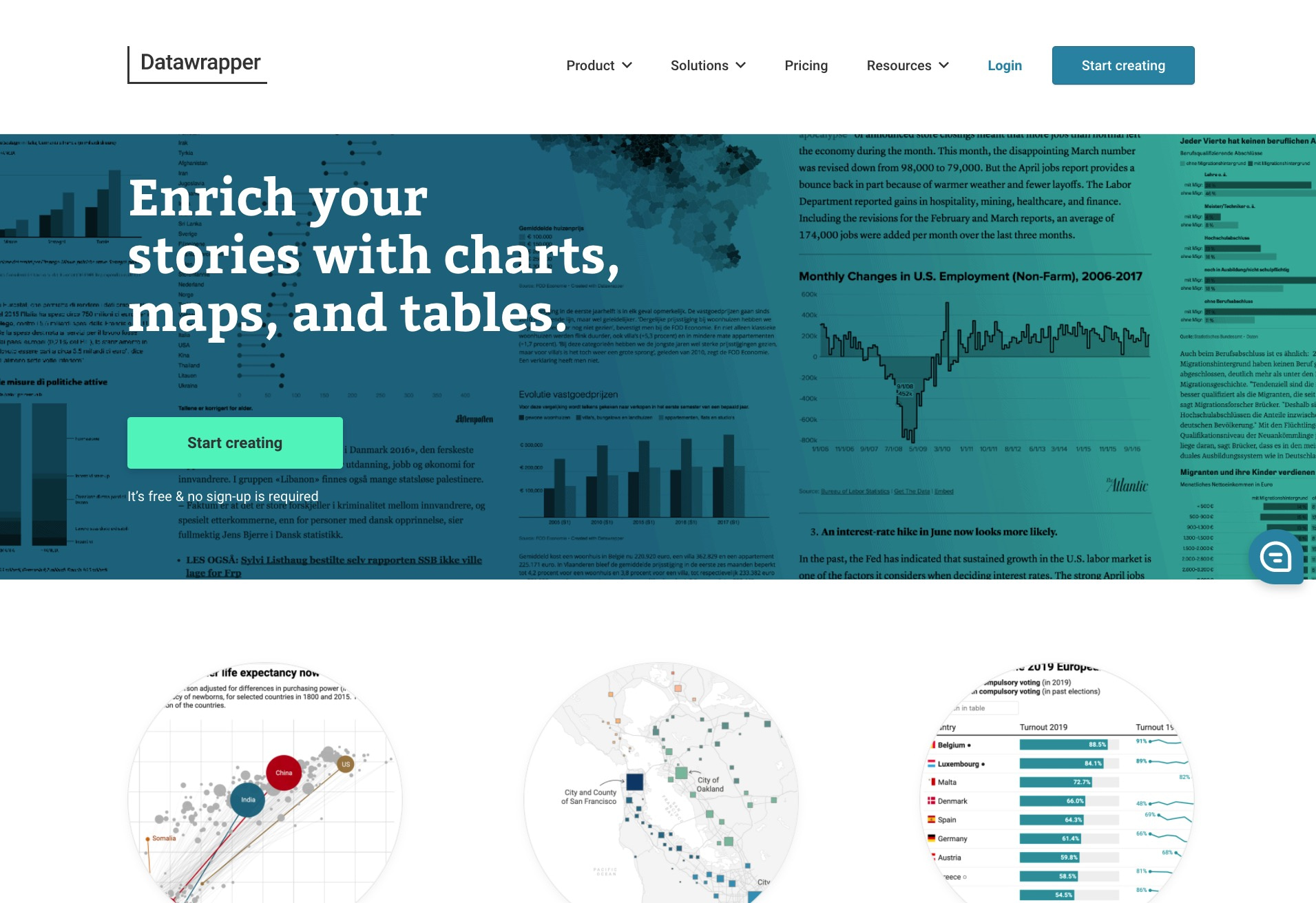
⚙️ Features:
- Access data from any source – copy data from the web or upload CSV/XLS files
- For live updates, link to any URL or Google sheet
- By default, all visualizations and data are private
- 20 chart types, maps, and tables that include search and heatmaps
- Team collaboration is possible with Slack integration and admin permissions
- Visualizations can be exported as PNG, SVG, and PDF
- Can scale up to support millions of users
- Print-ready graphics
💵 Pricing: With attribution in the footer, there’s no limit to the number of charts a single user can create using just the free plan. In addition, there’s no limit on the number of views.
The Custom plan is tagged at $599/mo, with a two-month discount on annual payment. It permits ten user licenses without Datawrapper branding. As for the Enterprise Plan, which permits self-hosting of visualizations and on-premise installation of Datawrapper, you’ll need to request for a quote. The best part? Visualizations stay online forever, even if you discontinue subscription.
5. Infogram
Infogram is one of the best data visualization tools with features and plans to suit anyone. With real-time permissions and version history, it allows entire teams to work on a project in real time. What’s more, it’s easy to use and anyone can tell an engaging story in just a few clicks without having to know the code.
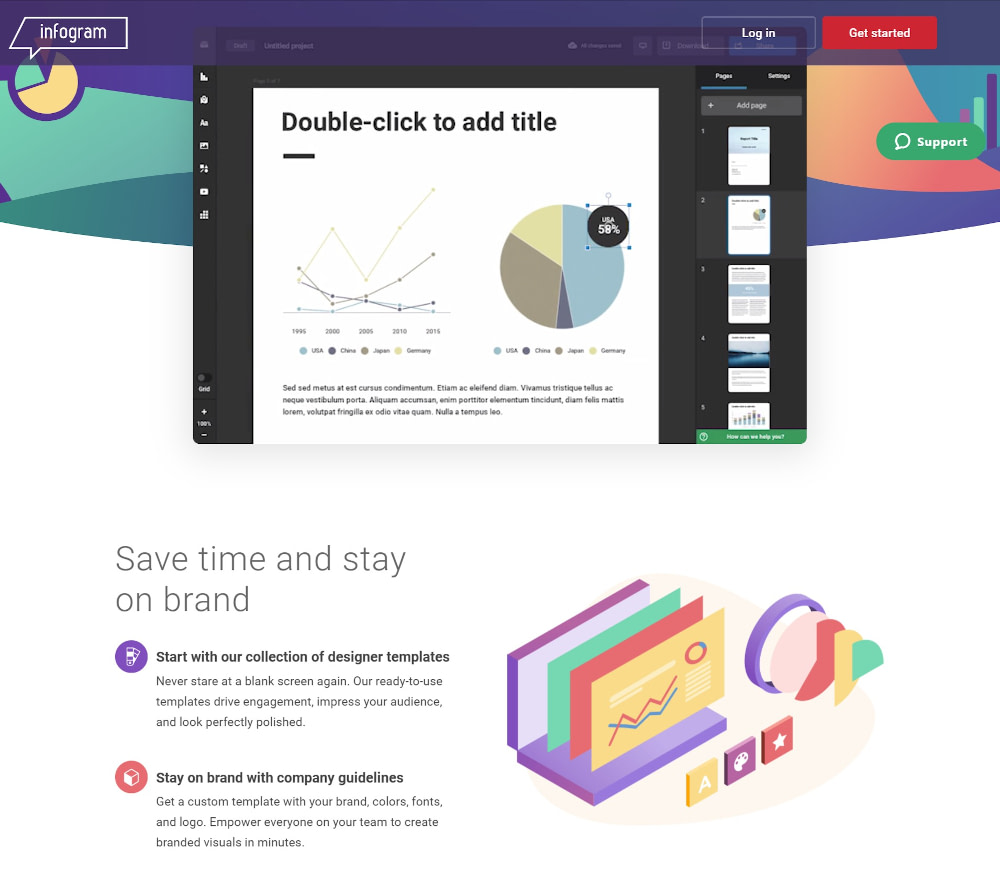
⚙️ Features:
- Ready-to-use templates, plus you can also use branded templates
- Interactive charts and maps that include links, tabs, tooltips, and clickable legends
- Use infographics, reports, and slides to showcase data
- Responsive infographics that look neat on all devices and on most social media
- Extensive library of icons and photos to create stunning visuals
- Data connects to live, shareable dashboards
- Powerful analytics that tracks user activity on website
💵 Pricing: The Basic free forever plan for up to ten projects allows you to use 37+ interactive chart types. The Pro plan at $25/mo allows access to premium templates and images, downloads, and private sharing. The Business plan at $79/mo is for those who want to use their brand elements and create unlimited pages per project. For teams that need to collaborate in real time and need engagement analytics, the Team plan at $179/mo is most suitable. You’ll save anywhere up to 24% if you make annual payments.
6. Microsoft Power BI
Microsoft Power BI spans several use cases, from improving passenger experiences to cutting down medication errors, or even simply improving digital experiences. That’s because it enables employees at every level in decision making using real time analytics. It helps transform complicated information into easy-to-understand-and-share visuals.

⚙️ Features:
- An extensive library of data visualizations to help you get started
- You can use custom data visualizations to build visuals in line with your specifications
- All plans provide data security and encryption
- Connects to more than 100 data sources
- Allows to publish reports to share and collaborate
- Advanced AI features include text analytics, image detection, and automatic machine learning
💵 Pricing: Besides a free trial, three plans are available: Power BI Pro at $9.99/user/mo and Power BI Premium at $20/mo/user or $4,995/mo (at enterprise scale). The maximum storage is 10 GB on the Pro plan and 100 TB on the Premium plan.
7. Chart.js
Chart.js is an open-source, community-maintained project that uses flexible JavaScript charting. It’s suitable for designers and developers who want to build different chart types and customize them extensively.

⚙️ Features:
- Eight chart types to visualize your data
- Each chart type can be animated, customized, or combined in a mixed chart
- Charts use HTML5. As a result, they render perfectly in all browsers
- Start building a chart using the HTML5 element and JS function. Go on to add datasets, labels, and other configurations
- Clean and intuitive API
💵 Pricing: Free for both personal and commercial use.
8. Chartblocks
Chartblocks is an easy-to-use online chart building tool that allows you to import your data, design your chart, and then start sharing it – all within minutes. There’s no need to know coding. You’ll be able to choose from dozens of chart types and then customize them to suit your needs.

⚙️ Features:
- A data import wizard that allows you to pull data from any source, including multiple sources at once
- You can embed your charts on any website or share them using built-in social media tools
- Export your charts as editable vector graphics
- Simple chart building wizard to pick the right data for your charts
- Update data directly in the Chartblocks app or set up scheduled imports
- HTML5 charts that display on any browser or device
💵 Pricing: Chartblocks is free for personal use for up to 50 active charts. With the Personal plan, you’ll also be able to make your charts private and export charts as PNG images or vector graphics. The Professional plan comes at $20/mo and removes branding from your charts. The Elite plan at $65/mo grants API access and charts automatically poll for new data. The plans allow monthly views ranging between 50,000 – 2.5 million. All plans are pay-as-you-go and allow for easy switching.
What else is out there?
Above, we showed you a particular set of data visualization tools. They are all great and cover several possible purposes and use cases.
However, if you’re just looking for a simple way to add data visualizations to your WordPress website, try out Visualizer. It’s a WordPress plugin of ours. You can use it to add all sorts of charts and graphs to your WordPress site easily.
Do you have any questions about the data visualization tools that we listed above? Feel free to ask away in the comments.


Or start the conversation in our Facebook group for WordPress professionals. Find answers, share tips, and get help from other WordPress experts. Join now (it’s free)!