
If you’re seeing the “Background and Foreground Colors Do Not Have a Sufficient Contrast Ratio” error in Page Speed Insights, it indicates that there are elements of your site’s design that fail to meet accessibility requirements.
In this post, I’ll explain what causes this error, explain how to fix it in three simple steps and discuss why ensuring sufficient color contrast is crucial for creating an inclusive web environment.
Let’s get to work.
What is the “Background and foreground colors do not have a sufficient contrast ratio” message?
The “Background and foreground colors do not have a sufficient contrast ratio” error means the contrast ratio between the two elements doesn’t meet the recommended standards. For example, you might be using a similar shade of gray for both the background and the text.
These standards are established by the Web Content Accessibility Guidelines (WCAG) [1]. This is a set of internationally recognized guidelines for making web content more accessible. WCAG suggests a minimum contrast ratio of 4.5:1 for normal text and 3:1 for large text to ensure optimal legibility.
If you’re not sure how these ratios work, don’t worry. We’ll take a closer look at them 🔎 in the tutorial.
There are some exceptions to these requirements. These include text and graphics that are not vital for understanding the content or functionality:
- logos or incidental graphic elements,
- text within disabled controls or disabled buttons
- text forming part of a logo is not subject to any minimum contrast requirement.
⚡️ Pro tip: The most common low contrast issue I’ve seen when reviewing the Page Speed Insights reports comes from using text that is too light for its background. Consider these examples:
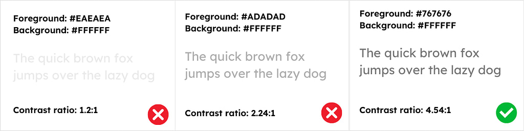
Many people use light gray text to tone down the prominence of elements like image captions or affiliate disclosures on their pages. This is not something you want to do if you want to adhere to the accessibility guidelines. As you can see from the example above, the minimum contrast ratio of 4.5:1 is still very dark text.
How to fix the “Background and foreground colors do not have a sufficient contrast ratio” accessibility error
A poor contrast ratio can alienate a portion of your visitors. Plus, this lack of accessibility will reflect badly on your business. Therefore, let’s look at how to fix it.
- Step 1: Identify which elements show low contrast
- Step 2: Determine the contrast ratio of your elements
- Step 3: Adjust the colors to meet the recommended contrast ratio
Step 1: Identify which elements show low contrast
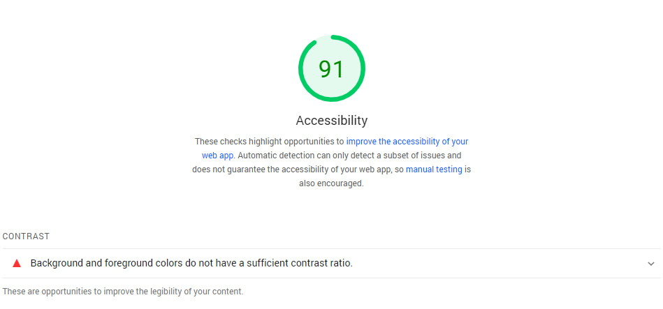
PageSpeed Insights can help you pinpoint the elements on your page with insufficient contrast. To get started, you’ll need to generate a report for the page you want to test. Then, scroll down to the Accessibility section and have a look at the recommendations.
If you see the “Background and foreground colors do not have a sufficient contrast ratio” message, you can click on it to see a list of the elements in question, including their CSS class:

Since PageSpeed Insights only enables you to test one page at a time, these elements should be easy to identify. However, if you’re unsure, you can use your browser’s inspection tool to look for the code of that element within your page.
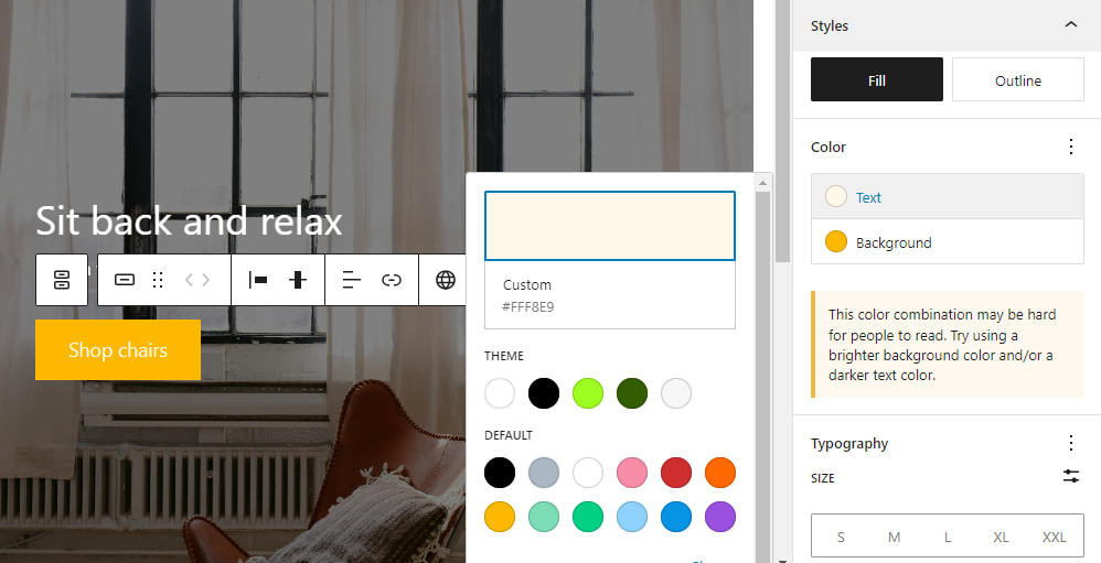
For the purposes of this tutorial, let’s say that we have this cover block on our page that has a button with insufficient contrast ratio:

Step 2: Determine the contrast ratio of your elements
This is where things get fun. Once you know what elements you need to check, you’ll want to use a color picker tool or extension within your browser. These are tools that enable you to click on specific parts of a page and see its unique hex code.
If you’re using Chrome, you can consider Chrome extensions like Smart Color Picker or Geco. For macOS, you can try ColorSlurp. Whichever tool you choose, you can use it to get the hex code for both the foreground and background elements that show insufficient contrast.
In our example, the background color refers to the yellow hue of the ‘Shop chairs’ button, while the foreground color is the color of the text displayed on that button.
When you have both hex codes, you’ll need to use the WebAIM Contrast Checker to check them. This tool will automatically show you the contrast ratio between these colors:
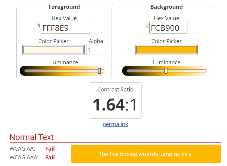
It will also tell you if the colors you’re using meet the WCAG accessibility guidelines. If you get all passes, you’re good to go. If not, we recommend adjusting the colors using the bars below the codes until you find a happy medium.
Step 3: Adjust the colors to meet the recommended contrast ratio
This last step is simple, particularly if you’re using WordPress (which is a highly-accessible platform). The exact steps will vary depending on where on your website the elements with contrast issues are located.
The easiest ones to fix are the errors that are located in the content of your pages. Here’s how you can easily fix these.
If you use the Block Editor, you can click on any block to access its settings. From there, you’ll be able to edit the color.
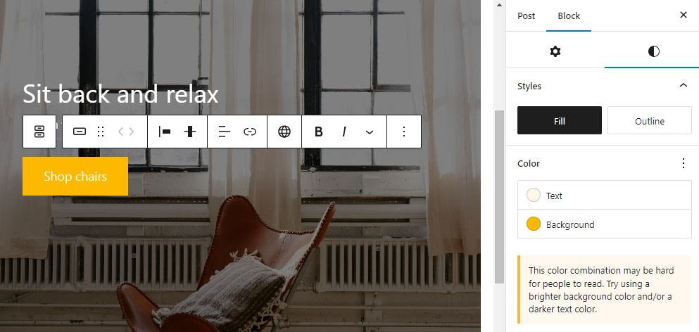
Each option under the Color menu enables you to modify a specific element within the block, such as the text or background. When you select an option, a color picker will appear.
Now, click on the gradient and enter the hex code you want to use:
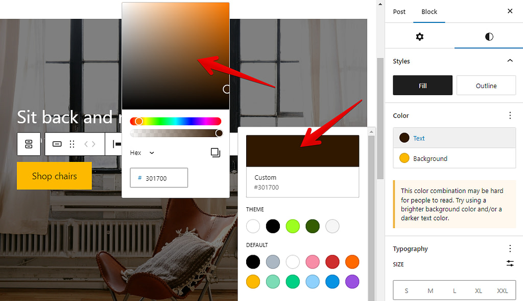
As you can see from the screenshots above the Block Editor will automatically display a warning message if the color combination of your elements is hard for people to read.
Once you’re set, save the changes to the page and test it using PageSpeed Insights. If the new colors have a sufficient contrast ratio, the error message will not appear anymore.
If the elements that have the contrast issue are located outside the content of your page, such as in the header or footer of your website, you can typically adjust their colors using your theme’s settings in the Customizer.
If your theme lacks the option to modify the color settings of these problematic elements, you can fix all of the contrast errors by adding some custom CSS code to your theme.
The importance of contrast in web accessibility
Contrast plays a crucial role in web accessibility. It ensures that everyone can read and understand the content on the page, regardless of their visual abilities. Adequate contrast between foreground and background colors makes it easier for individuals with low vision or color blindness to navigate and understand the content.
The share of people with low vision is prominent. In the US alone, 2.5% of the population has a visual disability. That’s a significant chunk percent of users that might be turned away from your website because of accessibility issues.
Good color contrast increases the user’s readability and ensures that even people without vision impairments have a positive experience when viewing your content.
Fix your color contrast ratio errors for good
When you use PageSpeed Insights to test your site’s performance, you’ll also get an accessibility report. If you see the “Background and foreground colors do not have a sufficient contrast ratio” warning, it means that users with visual impairment may struggle to see the elements on the page.
📌 Here’s what you need to do if you run into this error:
- Identify which elements show low contrast.
- Determine the contrast ratio of your elements, using a tool like the WebAIM Contrast Checker.
- Adjust the colors on the page to meet the recommended contrast ratio.
Do you still have any questions about how to fix the “Background and foreground colors do not have a sufficient contrast ratio” error in PageSpeed Insights? Let us know in the comments!


i need to solve the problem “Background and foreground colors do not have a sufficient contrast ratio”
Or start the conversation in our Facebook group for WordPress professionals. Find answers, share tips, and get help from other WordPress experts. Join now (it’s free)!