
You often hear about the importance of landing pages for businesses. 💼 Perhaps you’ve already read some articles focusing on landing page tips or on best practices when creating them. However, this is all just a theory. A better way to get insight into what your own landing page should look like is to analyze actual landing page examples that real brands use.
The goal 🎯 of this post is exactly that – to show you various examples of landing pages from existing online brands. This will help you understand how successful companies utilize this marketing tool.
👉 In this article, we’ll feature 30 real landing page examples from brands that you have heard about before – or at least most of them.
Real landing page examples for your inspiration
Let’s talk about each landing page individually to understand what’s interesting about it and why it works. The landing pages are listed in no particular order.
Copyblogger
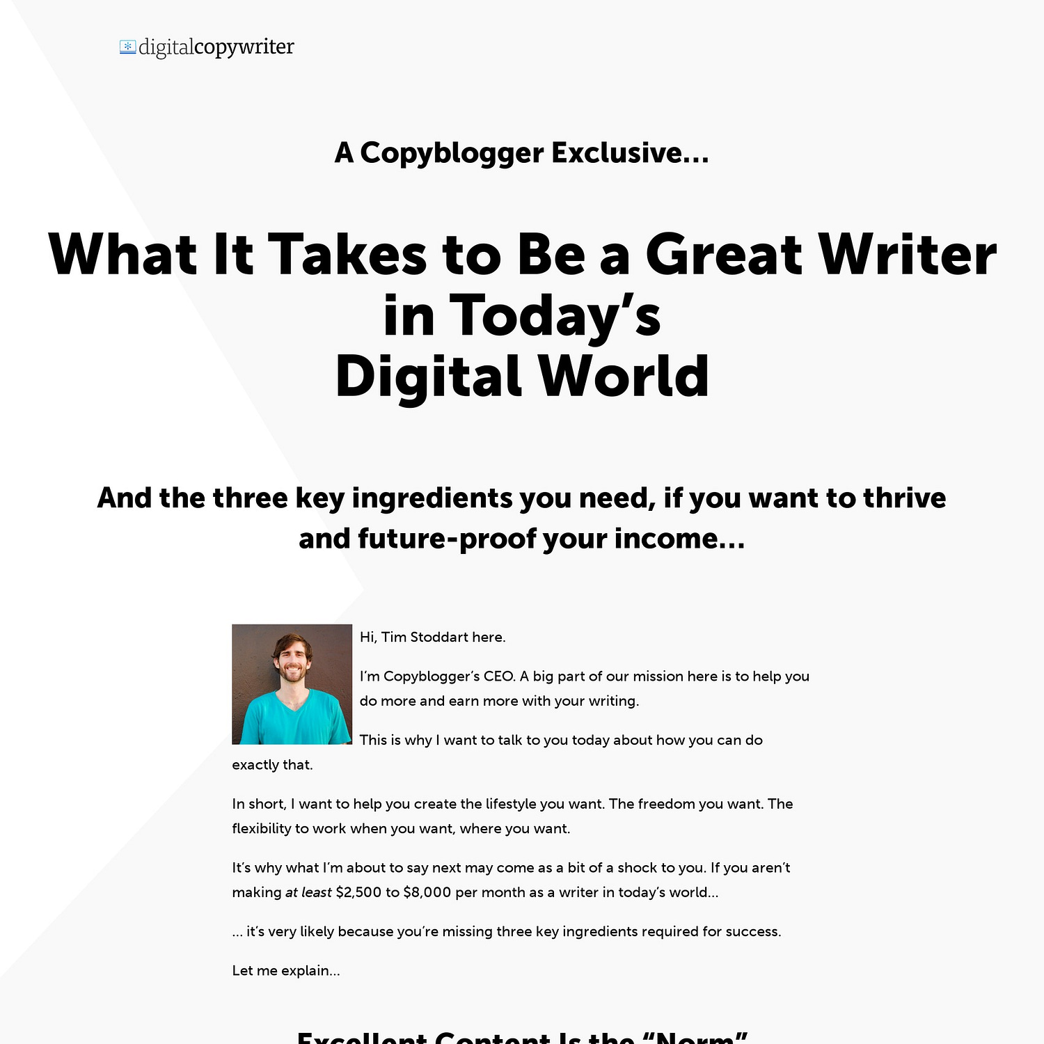
This landing page is an example of one that uses long-form copy. It takes an informative approach to achieve its promotional goals. Its purpose is to make you sign up for the Copyblogger membership.
The company relies on the fact that information is power. It believes that if they make their potential customers more aware of what they’re being asked to buy, that those readers will be more likely to make a conscious buying decision. As a result, this will expand Copyblogger’s membership community.
It’s worth noting that the first call to action on this page shows up near the end of the content and repeats itself several times afterward, urging people to join.
Codecademy
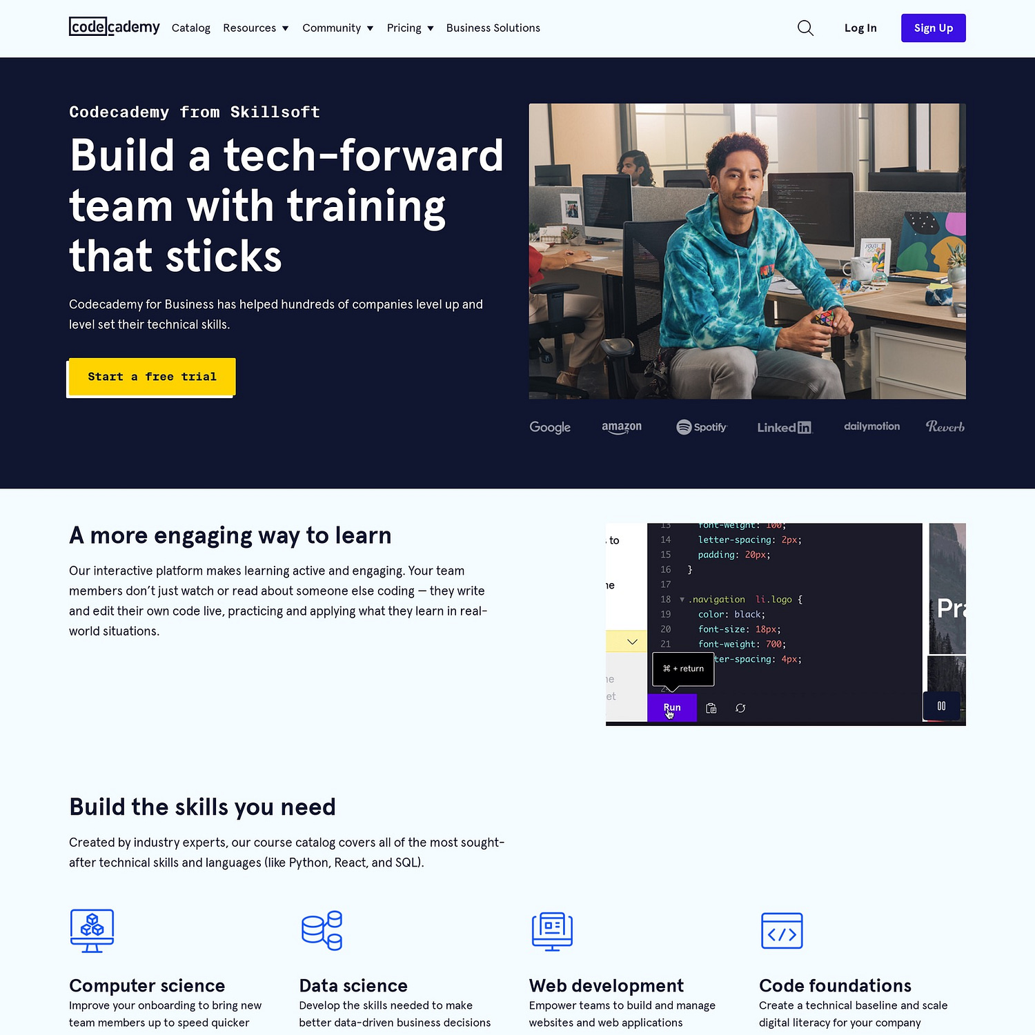
Codecademy’s training for businesses has a landing page that highlights what you receive, as a company, if you join their program. It’s a visually enticing page that comes with calls to action that reflect Codecademy’s brand.
With a concise summary of what their business plan offers, this landing page checks it all in terms of must-have elements that bring in results.
Idealista

When we think of designing the perfect landing page, one of the most important concepts to consider is search intent. We want to keep in mind whether or not our page is going to match the “why” behind why someone clicked on us versus some other search result.
Idealista has some of the best landing page examples that showcase what this looks like in action. Their overall website features different real estate properties available for rent (or purchase) in Portugal, but they also have landing pages for very specific search queries – and boy do those pages deliver on impact!
As you can see from the one above, the purpose of the page couldn’t be any clearer. Plus, just below it is a very compelling reason for why the searcher should stay on the page. It’s an excellent example of a landing page that conveys – within seconds – why the visitor who landed on it doesn’t need to go anywhere else. The message is straightforward: Idealista is your solution.
Uber

Uber has a landing page that recruits from the supply-side of their business model, which in their case is their drivers. The page uses a simple black-and-white color scheme, with compelling copy and a form for prospective drivers to complete. Below the fold, visitors can learn about the benefits of driving for Uber. They’ll also get a list of required documents they will need to be accepted.
All this information is short, concise, and easy to follow. It’s not crowded or confusing. To expand a section, visitors are provided various calls to action that open up on another page where they can learn more about that topic.
The FAQ section at the end of the landing page is also a way to get fast access to the most common curiosities.
Optimole

This is an example of a landing page that offers people the chance to test the tool before buying it. It’s like a proof of concept that takes the form of a landing page.
In this case, the results of the test may convince the visitor to at least try the product and, hopefully, eventually purchase it. This is a good example of a marketing strategy focused on attracting new customers by offering them a test-drive, so that they can experience how the product works right on the spot.
CodeinWP
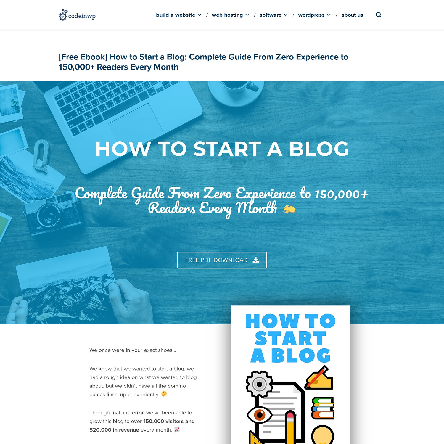
The goal of this landing page is to increase downloads. It promotes an eBook in a fashion that’s similar to Copyblogger’s membership initiative, but with less content. It summarizes the contents of the eBook using both written and visual elements.
What’s great about this landing page is the efficient mix of clear content and cool design. It keeps the visitor engaged and eager to find out more.
Shopify

Shopify’s free trial is one of the more minimalist landing page examples featured in this article. The copy is short, and the intent is clear. There’s a field for the user to add their email address, a call to action, and an image of a store.
If you scroll down, you will also see the three most convincing Shopify features, a customer quote, and a small FAQ. On this landing page, the company is able to briefly sum up what Shopify is about with a user-friendly layout.
Smart Passive Income

Pat Flynn, the man behind Smart Passive Income – or SPI – certainly knows what he’s doing when it comes to building a successful online business. His landing page examples are no exception. The one shown above happens to be for his All-Access Pass course collection, where visitors to his website can purchase access to a variety of valuable information.
What’s excellent about this page is that it leads with value. Pat doesn’t mention the price until you’re already significantly invested from a scrolling perspective, and therefore you’ve presumably read all of the benefits you’ll gain by buying this pass. Below the price he also has an FAQ section to address any lingering questions that a reader might have about the program. The urgency banner showing that the price will rise in the near future is also a nice touch to any landing page.
ēdn

This is another lively landing page example that grabs your attention. It’s a subscription-based company that sells smart gardens and wants to get new members on board by using this landing page.
The fresh design and strategic use of green color variations makes it easy to navigate and understand all the conditions and benefits of joining their membership program. The page has cute icons, a nice table that briefly displays the perks of becoming a member, and some product recommendations to begin your membership.
Ahrefs

Another good landing page example that invites visitors to directly test their product is Ahrefs free SEO tools. By testing, trial members immediately get to use the tool, and many of them eventually turn into frequent users.
This kind of landing page is engaging, provides value by giving the visitor data right away, and offers a palette of tools that reinforce why the potential customer would want to use Ahrefs (i.e., – to improve SEO). With all of these prospective benefits on the table, the Ahrefs landing page gets the company leads on a regular basis.
Fitbit

This is a smart one among our landing page examples. Created by Fitbit, the page aims to help potential customers find the best product for their needs. Since the Fitbit catalog is huge and, hence, can be overwhelming, they created a quiz to help visitors narrow down their choices.
The simple design of the landing page is mostly based on images, calls to action, and a few actionable words.
Google Workspace
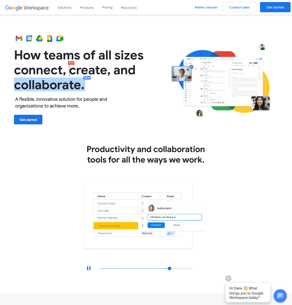
Most landing pages that Google creates are rather minimalist, and this one is no exception. This particular one includes visuals like images, short video clips, news bits, banners, and stylized copywriting. The page also shows a preview of what editing a document looks like with Google. This is a nice added touch to the overall presentation.
BloggingPro

BloggingPro’s redesigned homepage is an excellent example of a very user-centric landing page. There are two very clear call-to-action buttons right at the top. The contrasting color scheme makes them immediately standout and there is absolutely no ambiguity around what the site visitor will get on the other side of their click.
Then, just below the main conversion goal, there is a super short sentence, written in a conversational tone. It informs the visitor that should they not be interested in the main offerings, that there’s still reason to stick around. Just underneath, you’ll find the next section, which centers the reader by asking in big, bold font: What do you need the most help with?
Adjacent to the question are four categories with four call-to-action buttons and brief explanations that serve as four potential responses to the question itself. The goal is to turn first-time visitors or casual visitors into devoted readers of the blog, based on what they need the most help with.
Medium

One of the coolest landing page examples featured here, Medium uses simplicity to gain new paid members. What stands out about this landing page is the focus on visual presentation and sharp copywriting.
As opposed to other landing pages that use long-form content to provide extensive information, Medium does it using brief, focused copy with a simple call to action – start reading – and it’s all wrapped up in a beautiful design.
Nol Collective

If there was ever an example of a company who understands the concept of buyer persona and how to design landing pages around it, it’s Nol Collective. This purpose-driven fashion company immediately immerses you into the world of the people who design and produce the clothes they want you to buy from their website. They accomplish this through a clever combination of imagery and straight-to-the-point text.
Anyone who lands on this page, who has an interest in buying clothes that weren’t made in a sweatshop somewhere, and who wants to support small business owners, will resonate with the design of this landing page. The thin announcement bar at the top is also a minor, but useful feature, that makes this an overall great landing page example.
Spotify
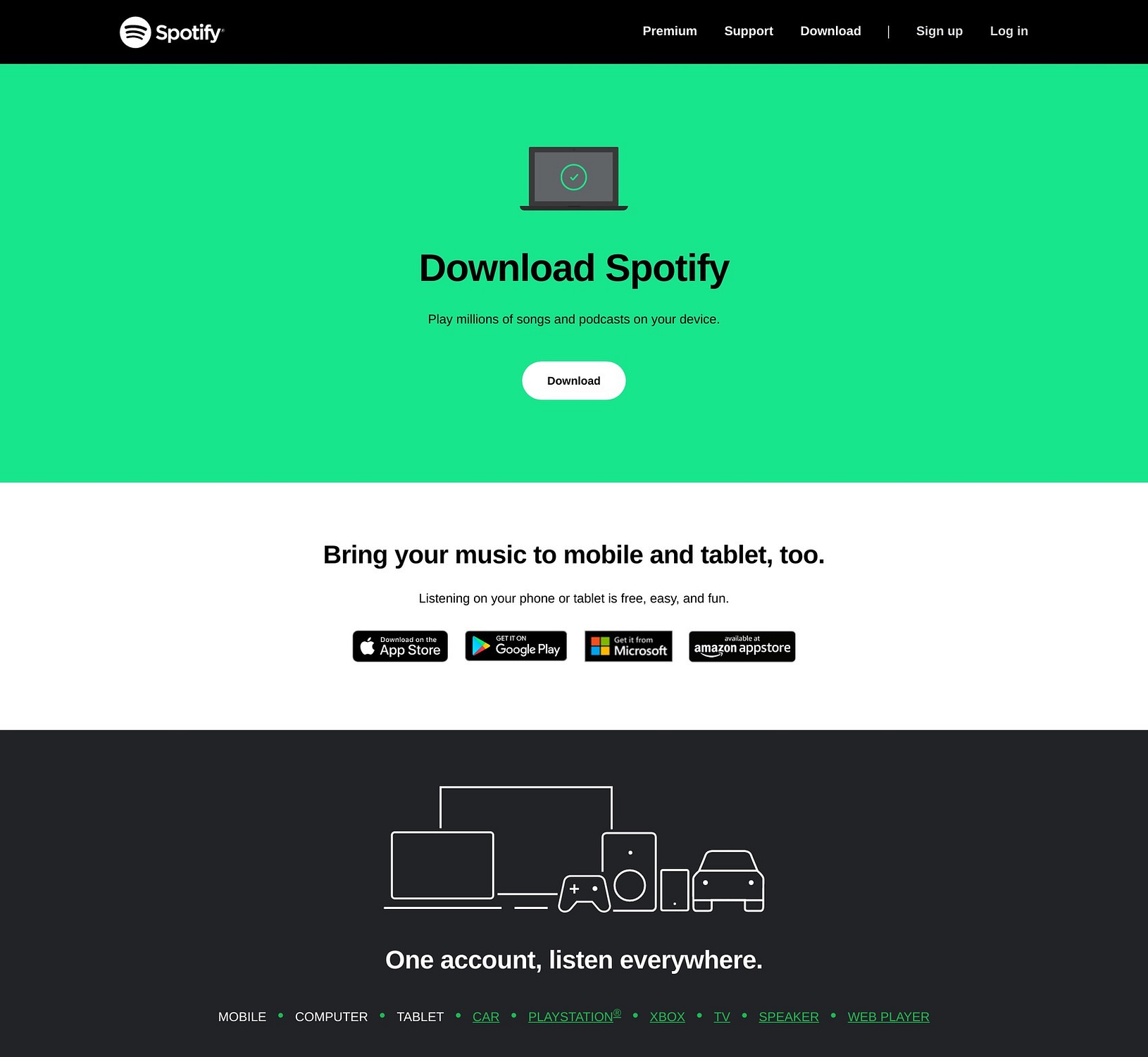
The Spotify download page is one of the most minimalist landing page examples on the internet. With a bright header and simple calls to action via text and buttons, Spotify ensures visitors won’t get lost in any lengthy details. They either convert, or they leave.
Paypal
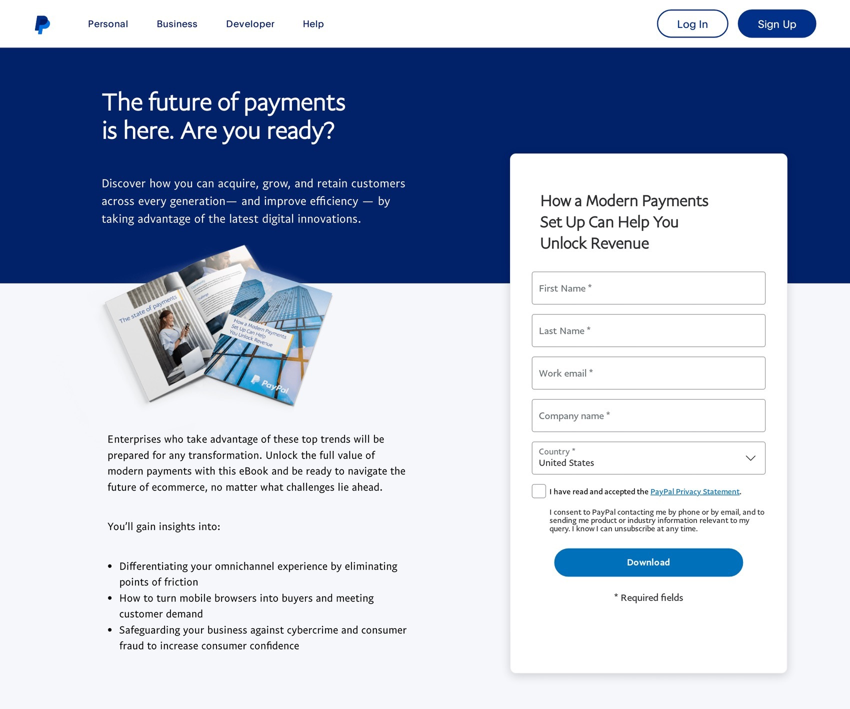
Paypal’s landing page is another example of an eBook promotion. It’s rather minimalist and focuses on efficiently passing on their message.
There’s no sophisticated design. What you see is formal business copywriting, along with a form. It’s simple, to-the-point, and generates leads by offering people a downloadable eBook in return for their personal information.
Click & Grow

This is another among our landing page examples that is meant to get people on board of a membership program. Through simplicity, they invite visitors to join their loyalty program by presenting its benefits.
The copy and the table are spot-on and highlight why joining the program only comes with advantages. The steps, form, and social proof (via social media posts) reinforce the overall presentation as visitors scroll down the page.
Codeable
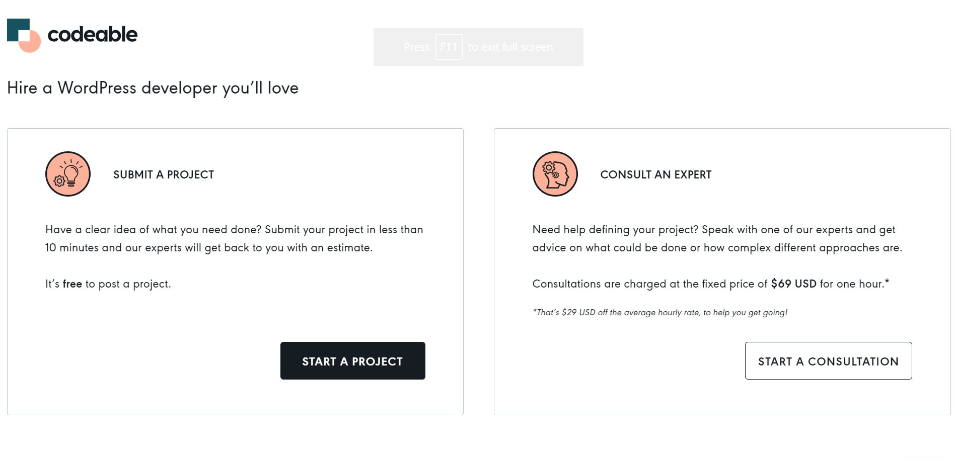
This is an example of a plain landing page where visitors see whitespace and parallel boxes of content that give two options to get started. There’s nothing to linger on here. The copy tells you what the page is about and how the two options differ.
For each option, there is a call to action that brings the visitor closer to their goal. The only visual elements here are the two icons and the minimalist layout. Even so, it doesn’t feel like there’s anything missing.
Your Online Life Coach
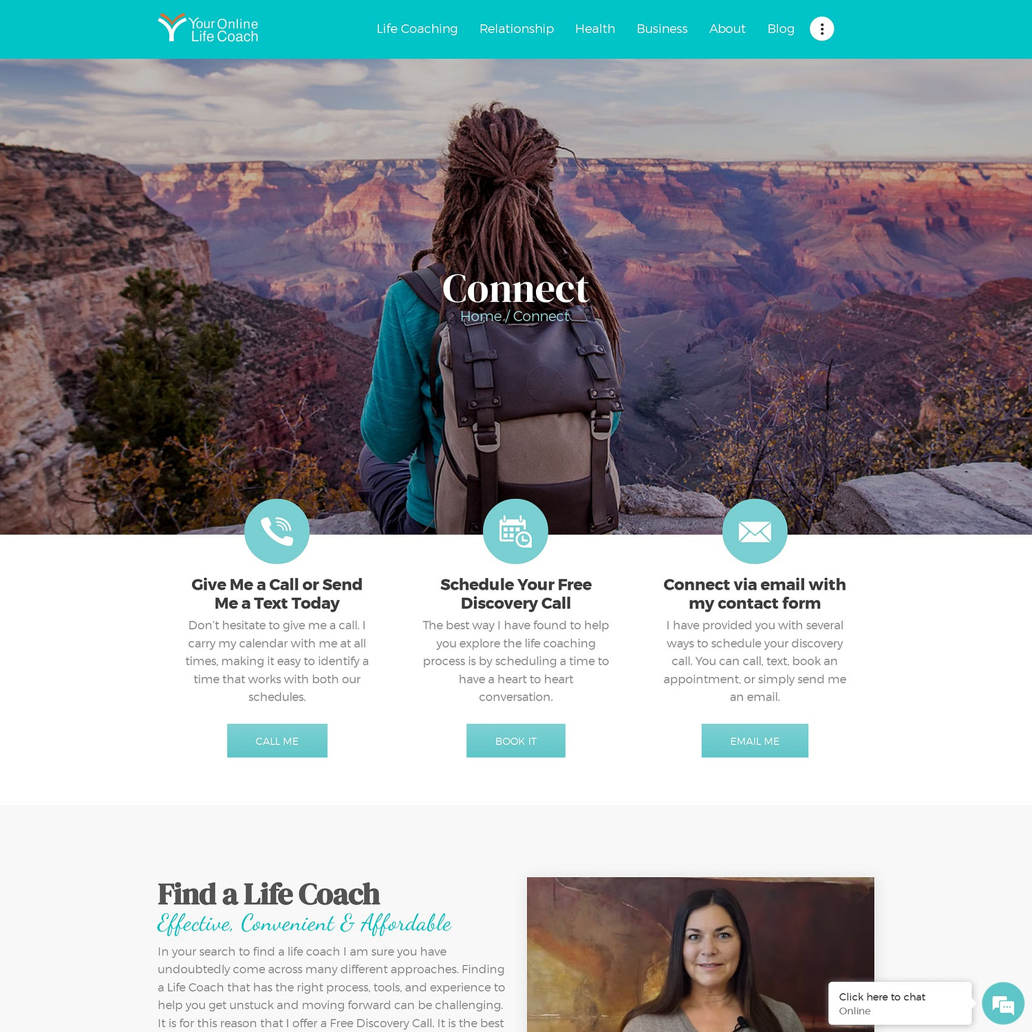
This example is a contact page that urges visitors to take action by providing various ways of getting in touch with a life coach. Even the URL says “find a life coach.” The design feels reassuring because it makes it seem easy to get what you need in just a few clicks.
It also features a short video, a few paragraphs of content, and yet another call to action in the form of a newsletter subscription button.
Zoom

This Zoom landing page for meetings starts with proof that this tool is one of the leaders in the online conferencing market. This type of data builds trust among people who have never tried the product before.
It continues with features and statistics, all presented in a visual-friendly interface – icons, images, columns, banners, and lists. The vibe is professional throughout.
MyFitnessPal

MyFitnessPal’s is a great addition to our list of landing page examples. It’s for their premium version of the app. The design is a lively one and it’s meant to display the contrast between the free features and the paid ones. The page uses bright colors, white backgrounds with unintrusive images, a table, and sharp messages.
Following the same lively and simple design pattern, MyFitnessPal uses a carousel for testimonials, two pricing boxes, and a short FAQ section. All of these elements are presented in just a few scrolls of a mouse or trackpad.
Canva

Canva’s free banner maker has a clear landing page that blends both informative content and images. Above the fold, you’ll see an actual banner as an example of what you can build with the Canva tool.
The text is shown in beautiful columns and quickly summarizes how easy it is to create a banner, followed by a few features that the tool provides.
WordPress

This landing page by WordPress invites visitors to start using the WordPress website builder in order to create a beautiful site of their own. The copy tone is personal and friendly and is an example of a short-form content landing page.
With a modern, colorful design, along with typography and images that stand out, the visitor is presented with what WordPress offers and what they’ll get if they choose to move forward with it.
The “Start your website” call to action is repeatedly displayed after each short section.
SEMrush

SEMrush’s SEO Toolkit landing page is meant to keep visitors engaged with all the free tools the company provides. Once a visitor clicks on one of the tools, it sparks their curiosity, and they end up spending valuable time on the website.
Since you need to create an account to access the tools, they get leads right away. The design of the landing page is simple: it comes with a clever call to action and a field where visitors can instantly test their domain.
Afterwards, they can scroll through the various products and click to learn more about each. There’s also a sidebar to the left, where the tools are listed plainly by category.
NextDraft
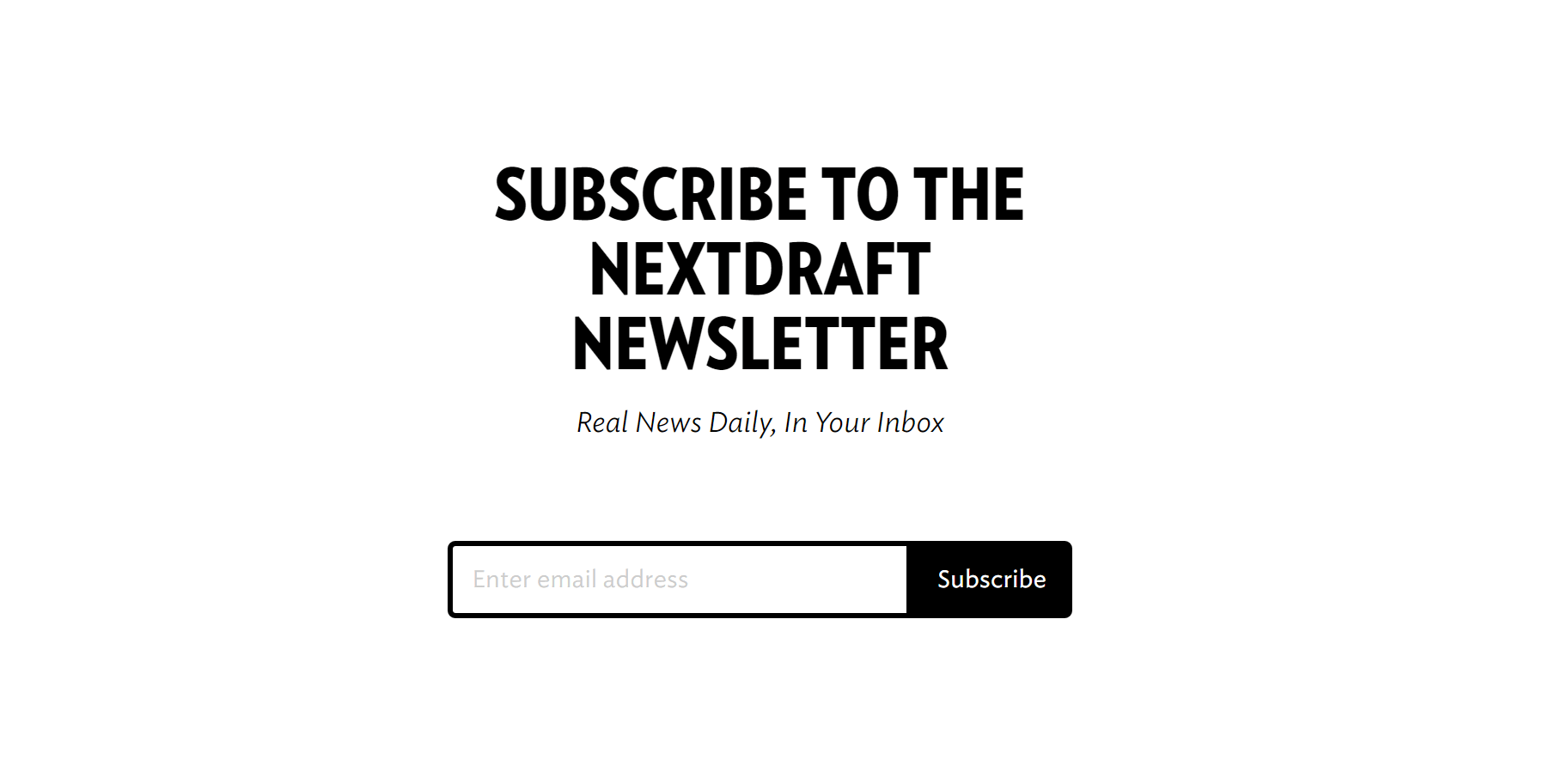
NextDraft’s newsletter subscription page is the one of the simplest landing page examples on this list. It’s probably the simplest. Visitors are asked to subscribe in the fewest possible words, with a design entirely made up of whitespace. The slogan is also simple and easy to remember, and it plainly explains what visitors are subscribing to in just six words.
Slack
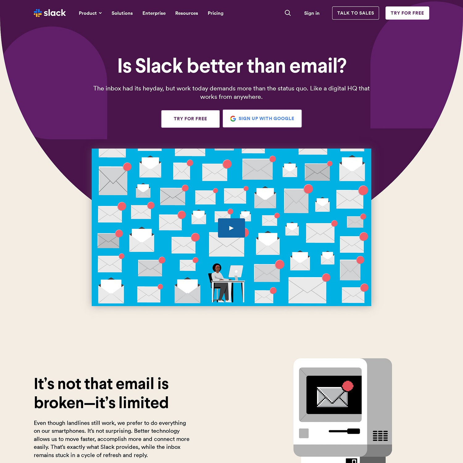
Slack’s known for a lot of things, so it’s perhaps no surprise that their landing page examples are also pretty optimized. This particular one juxtaposes Slack against one of the most established forms of messaging communication: email. It tries to convince visitors that Slack is a better and more advanced form of communication.
How? By mentioning the weaknesses of email and by emphasizing their own strengths. These are showcased in a dynamic design, with GIFs and animations.
Revolut

Revolut’s landing page for businesses is mostly based on visuals. Bold typography, brief bits of copywriting, colorful cards, and subtle animations. The cards actually highlight every feature in such a way that visitors cannot miss them.
Every card is clickable and leads to even more visual and interactive landing pages where visitors can learn more about the product’s benefits. The design overall is friendly, and it keeps you scrolling because the copy is short and easy to follow.
FinMasters

This is another cool landing page similar to the ones for eBooks. Even though this one promotes a template rather than an eBook, it’s still a downloadable digital product. The nice colors and the structure of the content make the page easily accessible and readable.
FinMasters uses columns with images and text to showcase what’s inside the template. The page also adds other useful points to consider before downloading. It has some of the most beautiful typography among the landing page examples on this list, which contributes to its overall visual presentation.
Booking
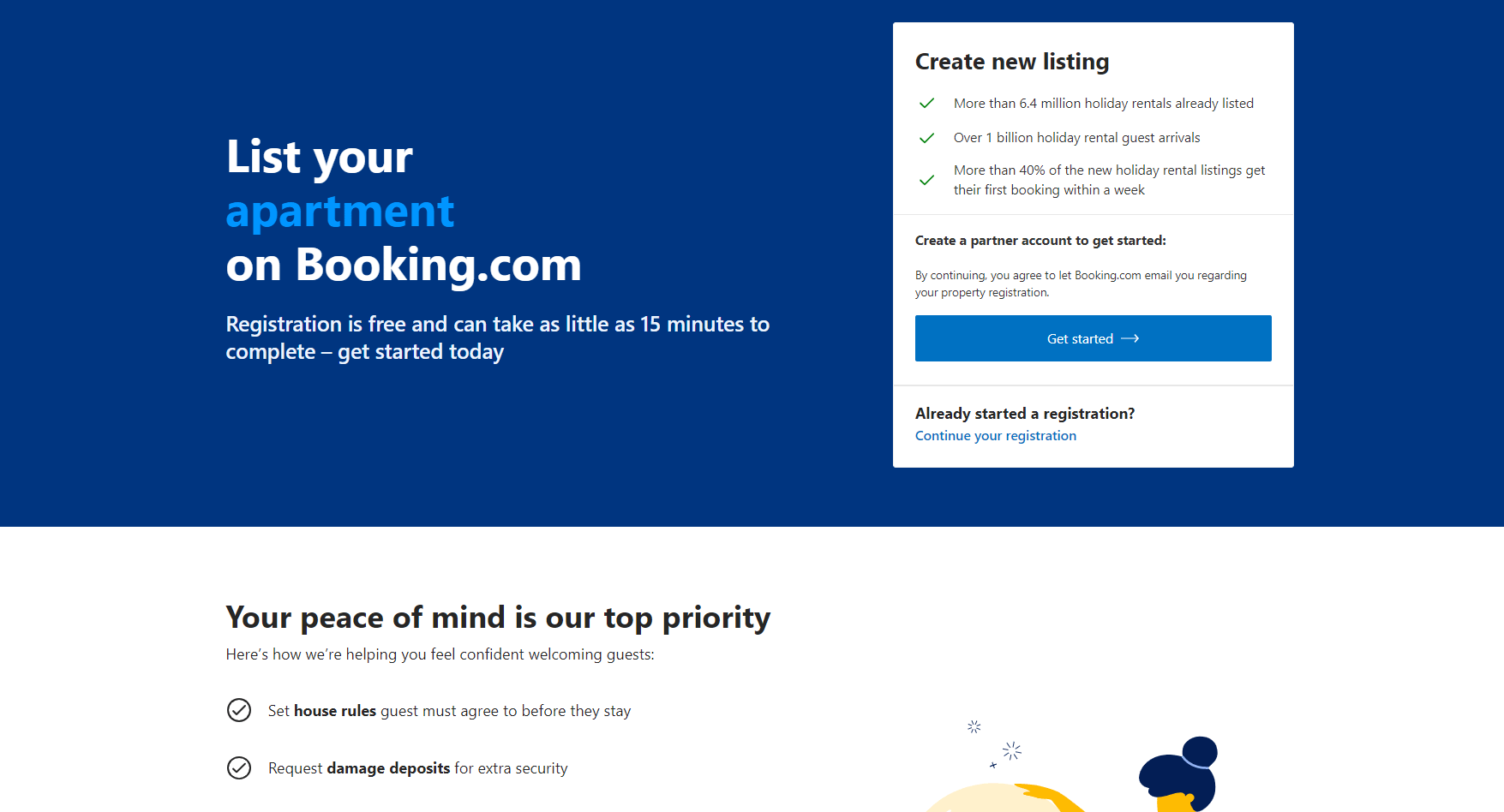
Similar to Airbnb, Booking uses this landing page to get more customers to list their properties on their platform. Above the fold, there’s a short copy clearly revealing the intent and a call to action.
Below the fold, there’s airy content in the form of checklists, boxes, columns with icons, and statistics. The structure and form make it easy to follow, so visitors can read the copy entirely.
Conclusion 🧐
To wrap this up, we hope that our list of curated landing page examples gave you a better vision of how an actual, effective landing page should look. As you saw, some are utterly simple, while others focus on captivating visuals and design.
What all of them have in common, though, are the calls to action and a clear message of what the page is about. Readers should know exactly what they’re signing up for or what they’ll be getting if they click on a call to action.
Another important aspect to remember is that all of these landing pages have only one single goal 🎯 – not more. Before creating your own landing page, you need to ask yourself: what do I want to achieve with it? The answer should have one scope (e.g., – make people buy a membership, make people donate, get subscribers, etc).
Which one of these landing page examples do you find the most appealing? Let us know if you have any other great examples that are worth sharing.


Or start the conversation in our Facebook group for WordPress professionals. Find answers, share tips, and get help from other WordPress experts. Join now (it’s free)!