What makes a good CTA (call to action)? In this post, we’ll share five strategies to help you create more effective CTAs on your website.
Your CTAs are the lifeblood of your online business. They should create urgency and stand out on your page. In essence, each CTA directly asks your visitors to do something about the product or service they like.
As such, you should put as least as much effort into creating a good CTA as you would the rest of your website.
Why you need a good call to action
Tweaking your CTAs, even in small ways, can have a significant impact on the success of your site or business.
For example, just by experimenting with their CTAs, the HubSpot team has been able to boost their conversion rates by up to 30 percent. What would you do with 30% more customers, email subscribers, etc?
In some cases, your CTA can be the difference between a conversion and a bounce. If not properly placed or optimized, visitors may be more likely to ignore what you want them to do, or miss out entirely.
Five ways to optimize your call to action
As we mentioned, there are many ways to optimize your call to action, to make it go from a mediocre CTA, to a good CTA. Using the following tips can help to give a boost to your conversion rates. To get started, let’s discuss how to make your CTAs stand out in more detail.
1. Make your CTA stand out from other site elements
From a design perspective, your CTA should stand out from your other content. It should be easy to recognize and understand – you want visitors to know what it represents, and where it is on your page.
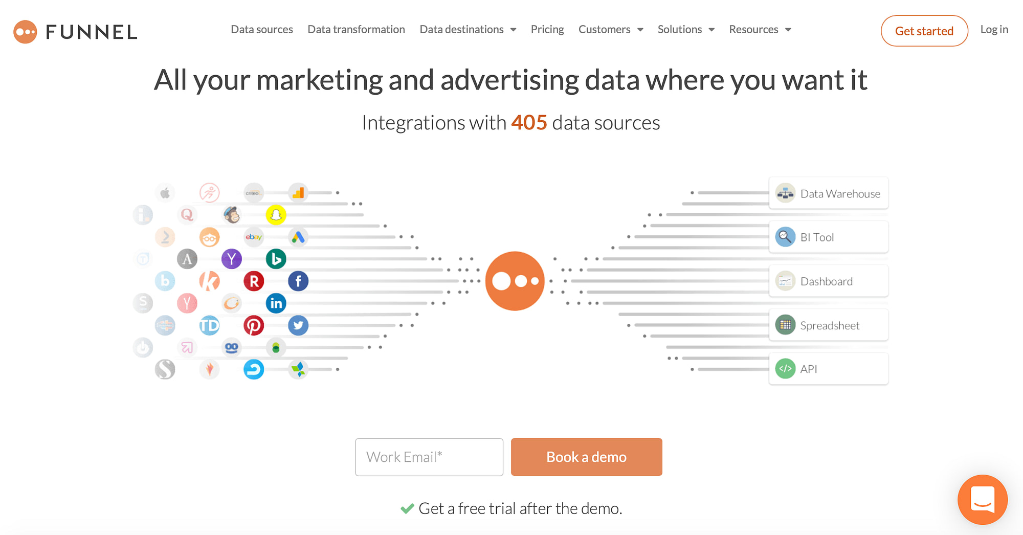
In this example, think about where your eyes are drawn. First, they may go to the company’s logo in the center, given the leading lines and use of negative space. Next, you’ll likely follow the logo’s color downwards to where it says Book a demo.
On this page, the Book a demo button is the CTA. It is designed so that we begin by experiencing a touch of branding (their logo), followed immediately by what they want us to do, which is to book a demo.
These elements stand out for a number of reasons we’ve already touched on. The color, as the CTA is a large orange button on a white background, and the negative space showcasing the page’s important elements — in other words, the CTA.
2. Create urgency to entice visitors to click your CTA
When you create a CTA, it’s important to use actionable language. This means you should use action-oriented, second-person verbs to encourage visitors to click.
This example uses a simple command statement: “Get started.” It’s telling us to click, but also that there’s more in store if we do. What’s more, the surrounding copy is filled with enticing statements, such as “try it yourself” and “get setup in seconds.”
All of these statements are actionable and empowering, giving users a choice, but hinting they might be missing out if they don’t click the CTA.
3. Consider different design elements to make your CTA clickable
Besides the CTA itself, you also have the surrounding design elements to consider. This includes text, images, and your overall site design.
As we can see, Lyft not only makes its good call to action button stand out by giving it a striking pink color, but also matches it to the website’s branding – specifically the logo. What’s more, the entire page is filled with information that points to the CTA.
For instance, the heading talks about “great things” and the copy beneath discusses experiences that “build relationships and drive results.” These are all positive statements to make you want to click the CTA, which in this case, will provide more information on how to be a Lyft driver.
In addition, the image to the right – while it does stand out – does not take away from the effectiveness of the strong CTA. Not only is the image spaced well away from the call to action, but it also is made up of mostly contrasting colors.
When designing yours, using a button makes your CTA naturally clickable. It also helps to make it large and surrounded by plenty of space to avoid any kind of confusion.
4. Personalize your CTA for maximum conversions from different audiences
Your business may have distinct audience groups that come to your site for different reasons. In this case, it may make sense to build separate CTAs for each one.
If you have different audiences, it may help to think about what they are looking for when they come to your site. For example, Armani Exchange uses different call to action buttons for men and women. This makes sense because there is a clear distinction between the products men and women are looking for.
You may also want to use different CTAs for distinctions such as beginners and experts, for example, or for various computer systems if you sell software. Implementing this strategy can earn you higher conversion rates over a single, generalized CTA.
5. Optimize your CTA for mobile viewing
Don’t forget about mobile browsing when you design and write your CTAs.
According to data aggregated by Statista, around half of web traffic happens on a mobile device. For this reason, your CTA needs to be optimized for mobile viewing as well.
In the example above, Slack uses an effective CTA button that renders just as well on a mobile device (it was taken using an iPhone) as it does on the desktop version of their website. This is considered best practice, and piggybacking off of this example is a good idea when creating a call to action for your business.
Start by opening your website on different mobile devices with different sized screens. You could even use the device selection options within WordPress or your page builder plugin’s front end. For another alternative, check out Google’s Mobile-Friendly Test:
Of course, there’s more to consider than just mobile devices and desktops. Tablets are also popular and come with a range of screen sizes too. Overall, keep checking your CTA for visibility and responsiveness on all manner of screens. If it isn’t rendering properly, go back to your site and tweak your CTA before reloading the page.
Create better CTAs today
Making sure you have a good call to action is a simple way to improve conversions. In short, when you create a call to action, it’s important to put careful consideration into both its placement on your pages and also its design.
In this piece, we’ve outlined several ways you can optimize your CTA. To quickly recap, they are:
- Make your CTA stand out from other site elements.
- Create urgency to entice visitors to click your CTA.
- Consider different design elements to make your CTA clickable.
- Personalize your CTA for maximum conversions from different audiences.
- Optimize your CTA for mobile viewing.
Of course, the next question is how you can measure whether the changes to your CTA have resulted in a positive effect. To that end, you’ll want to learn about Google Analytics. You can set up Google Analytics on WordPress and use tools like Event tracking and UTM parameters to track how effective your CTAs are at driving action and conversion.
Do you have any additional questions about how to create a good CTA? Ask away in the comments section below!












Or start the conversation in our Facebook group for WordPress professionals. Find answers, share tips, and get help from other WordPress experts. Join now (it’s free)!