
Building a do-it-yourself (DIY) website provides several advantages. You have complete control over your site, can personalize it to your tastes, and save your budget. However, creating DIY websites that look professional and can compete with developer-built sites can be tricky without any training.
Fortunately, if you take the time to learn a few web design best practices, your own site can come out looking top-notch. Even if you have no experience with creating websites, many of these tips are very simple to implement, especially on a platform such as WordPress.
In this post, we’ll introduce you to ten site elements you can incorporate to make your online space look professional.
Let’s get to it!
📚 Table of contents:
- Use a limited color palette to avoid overwhelming visitors
- Leave plenty of ‘white space’ to prevent cluttered pages and posts
- Choose a legible font to ensure readability
- Add high-quality personal photos to provide authenticity
- Include clear navigation and search functionality to help visitors find what they need
- Craft a well-written About page to build user trust and loyalty
- Incorporate Call to Action (CTA) buttons to boost your conversion rate
- Keep your headers and footers consistent to build brand recognition
- Prioritize mobile responsiveness to reach more users
- Provide easy-to-use contact forms to help users get in touch
Ten tips to make DIY websites look professional
1. Use a limited color palette to avoid overwhelming visitors
When you have free rein over your design, it can be tempting to try to create striking pages by using many bright and eye-catching colors. However, this can make just looking at your site an overwhelming experience. Professional designers know how to limit their color palette for maximum impact:
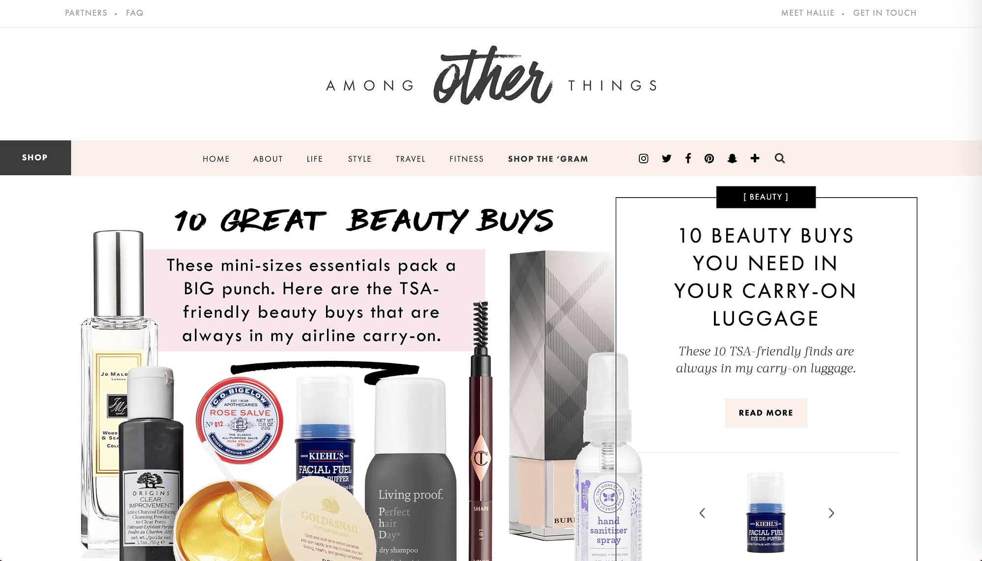
Color can translate a lot about your brand. Too many colors that make your website seem chaotic could project a sense of disorganization and indecisiveness. Instead, pick one main color, an accent color, then stick with neutrals. A tool such as Coolors can help you generate color schemes quickly and easily.
To help you nail your color choices, you can follow our guide to website color schemes.
2. Leave plenty of ‘white space’ to prevent cluttered pages and posts
White space refers to the blank areas on your site’s pages. They may not necessarily be white in color (‘negative space’ is an alternative description you can use), but these open spaces help prevent your site from looking cluttered and confusing to visitors:
Overall, a cleaner aesthetic helps users easily find what they’re looking for as soon as they arrive on your site. You can also use this design strategy to your advantage by directing users to Subscribe or Buy Now buttons through the use of white space.
3. Choose a legible font to ensure readability
Fancy scripts or graphic lettering might seem like a professional element to add. However, don’t confuse professionalism with complexity or cost. Just because you have to pay for a custom font and add it to your site doesn’t mean it’s high-end. Instead, prioritize legibility:
If your users can’t read your site, it doesn’t matter how much effort you put into acquiring your flashy typography. Keep your website’s main purpose – to deliver information – at the forefront.
For best results, pick two fonts and pair them together.
4. Add high-quality personal photos to provide authenticity
Images are an excellent way to improve your site’s content. However, stuffing your site full of stock photos isn’t a smart practice. Quality is far more important than quantity here. Personal photos seem more genuine, and can help build trust with your users:

Even so, you don’t want to just slap a grainy selfie up on your website and call it good. Low-quality images will also have a negative impact on your users’ perceptions of your site, so pay attention to features such as lighting and framing when taking and posting photos.
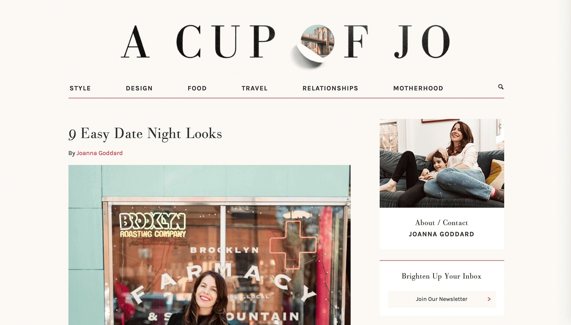
5. Include clear navigation and search functionality to help visitors find what they need
Whether your site has one page or dozens, your users need to be able to find their way around. Visitors come to your site for a reason, and if they can’t find what they need they’re more likely to leave than to go digging. This is why clear navigation is essential:

Adding easy-to-use navigation will enable users to quickly get where they want and need to go. Also, including site search functionality can help them quickly find posts or pages anywhere across your site.
6. Craft a well-written About page to build user trust and loyalty
Building a home page and providing information about your brand’s products or services are probably at the forefront of your mind when it comes to your site’s content. However, your About page plays a key role on your website too:
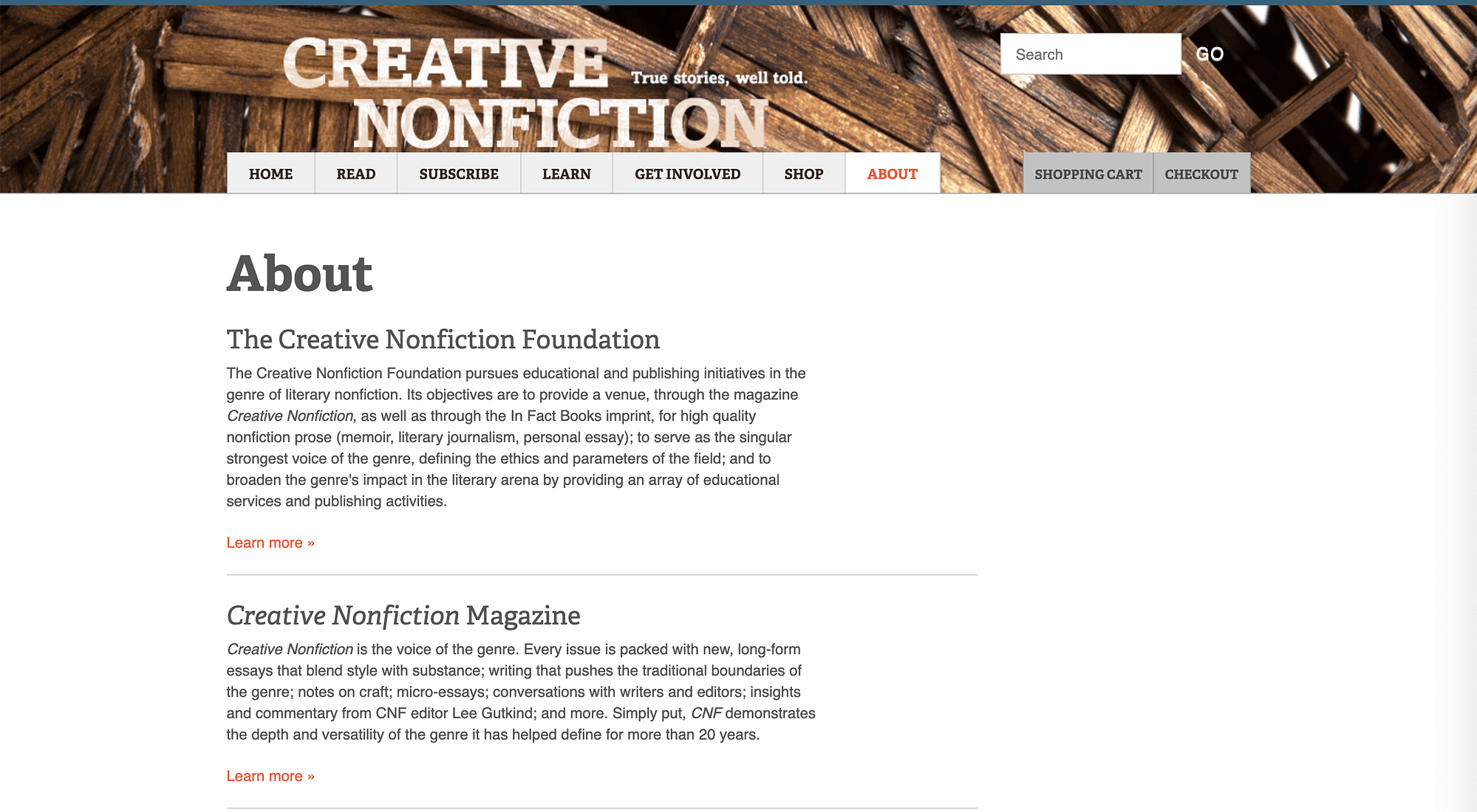
By sharing your brand’s story, mission, and values, you can humanize it to create a sense of trust and loyalty among your users. This can help give you an edge over your competitors, as people are more likely to stick with brands who share their values.
7. Incorporate Call to Action (CTA) buttons to boost your conversion rate
If you want to increase conversions, you should make it as easy as possible for users to convert. This is why so many professional sites have CTA buttons that say things such as Subscribe, Sign Up, or Buy Now:

Fortunately, if you’re building DIY websites with WordPress, you can now easily add buttons in the Block Editor without the need for a plugin or custom code. This makes it easy for you to add actionable and converting elements for your mailing list, memberships, products, and practically anything else you can think of.
8. Keep your headers and footers consistent to build brand recognition
Whenever your users need a product or service, you want them to think of your brand first. This is why brand recognition is key. Consistently using the same header and footer across your site is a smart opportunity to start making a strong impression on your users:
It’s especially helpful if your brand’s logo is included in one or both of these content areas. This important piece of your website’s identity is key to creating a recognizable brand.
9. Prioritize mobile responsiveness to reach more users
If you’ve ever pulled up a website on your phone and found you couldn’t read it because the text was too large or too small, you know how frustrating a lack of mobile responsiveness is. Your users feel the same way, and will likely abandon your mobile site if it doesn’t adjust to their screen size:
With mobile search now a significant source of conversions, and responsiveness factoring into Google’s algorithm, this isn’t an element you want to overlook. While in the past making your WordPress website mobile responsive was tough, practically every theme worth its salt is now ready to roll. For example, our entire collection of themes look great on mobile devices, although there are myriad to choose from.
10. Provide easy-to-use contact forms to help users get in touch
Another feature professional websites all have in common is easy access to the brand’s contact information, such as an address, phone number, and email. However, you can make it even easier for users to reach you by providing a contact form:

You might display this form on its own page or in your footer or sidebar across your site for easy access. There are several plugins you can use to create forms in WordPress, such as Contact Form 7 or Gravity Forms. Some page builders – such as Elementor – include quality tools to help build forms right out of the box, and plugins such as Jetpack also include basic functionality for displaying forms.
Conclusion
With more website-building platforms popping up almost by the day, DIY websites are on the rise. Saving money and taking control by designing your own site may seem attractive, but if your website turns out looking unprofessional and untrustworthy, your brand might suffer for it.
Fortunately, there are a few aspects of web design you can easily implement on your site to up the professional-looking quality. Creating clean visuals with a limited color palette and ample white space, building trust with personal photos and an About page, and adding interactive features such as CTA buttons and contact forms make for high-quality sites.
Do you have any questions about building DIY websites? Let us know in the comments section below!


Or start the conversation in our Facebook group for WordPress professionals. Find answers, share tips, and get help from other WordPress experts. Join now (it’s free)!