
If you want to improve the user experience on your website, you’re not alone. An easy-to-use site can mean higher traffic and happier visitors. However, deciding how to design your site for the smoothest possible experience can be tricky.
Fortunately, you don’t have to perfect your site through trial and error. By understanding a few universal techniques, you can better serve your visitors and take your web presence to the next level.
In this article, we’ll walk you through eight ways to improve the user experience on your site. Along the way, we’ll provide a few examples, as well as some tips to help you get started. Let’s dive right in!
How to improve user experience: actionable tactics
Here are the eight tactics that we’ll cover – keep reading for more details:
- Consider a visual approach
- Make sure your site is responsive on all devices
- Implement accessibility features
- Track your user experience metrics
- Use a marketing funnel
- Keep each page’s design flow in mind
- Make sure your content is ‘skimmable’
- Be careful with your ads
Let’s go through them…
1. Consider a visual approach
No matter how high-quality your content is, it’s possible to have too much of a good thing. Visitors who have to confront a wall of text may be intimidated. This could lead to them skipping over your best work.
Therefore, you might want to consider a more visual, image-based approach. One way to do this is by mixing up your formatting. Even the occasional photo gallery or video can break up lengthy content into a more manageable format. You can consider Pinterest as an extreme example of this method:

By focusing on the visual elements, Pinterest makes it easy for users to understand content at a glance – even when there are dozens of options. This can improve the user’s experience by helping them consume content quickly and easily.
Even if you have to rely on lots of text, try to insert photos and screenshots throughout to make it more digestible. With just a few images, you can break up an otherwise lengthy post into easier-to-read sections.
If you have a text-heavy post that doesn’t lend itself to additional photos, you can also create an accompanying infographic. This format conveys all of your written information in a way that’s easier to read.
2. Make sure your site is responsive on all devices
You probably don’t need us to tell you that there are lots of mobile users these days – 7.1 billion of them [1], to be exact. These visitors make up a huge part of your audience, so it’s important to improve your site’s mobile experience.
There are a few ways to make your site more mobile-friendly. One important step is to pick a mobile-responsive theme from the start. Virtually all modern themes are responsive by default, but we recommend digging in and actually testing how your theme works on different devices to make sure the user experience is optimal.
You might also want to create your menus carefully. Cluttered navigation can make it hard for users to find what they’re looking for. Therefore, consider building in plenty of submenus to reduce the options your users have to sort through on mobile devices:

You may also want to examine how much white space you’ve included. Since mobile screens are smaller, they can be harder to accurately use. If a user keeps clicking on the wrong tab due to minimal spacing, this creates a frustrating experience. Generous spacing can go a long way towards easing that pain point.
Finally, let’s talk about speed. Loading times are essential to smooth navigation. However, mobile loading times can differ from those on desktop devices. Using a tool like PageSpeed insights can help you ensure high performance on all devices.
3. Implement accessibility features
Making your website more accessible is key to improving the user experience for a group of visitors that often gets overlooked. An accessible website is one that users can navigate even if they have some motor or visual disability.
Without proper accessibility, some users won’t be able to experience your site’s content. However, there are a lot of strategies you can employ in order to change this. Two great ways to improve accessibility in WordPress include:
- Using an accessibility-ready theme. The WordPress Theme Directory includes a subset of accessibility-ready themes. These are themes that meet a number of criteria that make them more accessible to users with disabilities.
- Using accessibility plugins. We recommend starting by checking out the WP Accessibility plugin. This plugin addresses several accessibility issues including helping you identify images without alt text and adding labels to forms.
If you’re not using WordPress, there is still plenty you can do to make your website more accessible. The first step in your accessibility journey should be to offer text or audio alternatives to images. Being diligent about adding alt text to images and other media files will enable visitors to get an idea of what that content is even if they have visual impairments:

It’s also essential to ensure your site is easy to navigate using the keyboard. This can help visitors who can’t use a mouse and rely on the keyboard to navigate through pages and between them.
Finally, we recommend you watch for opportunities to increase visual contrast in your designs. One great way to do this is to ensure the colors of text in your pages contrast with the background so it’s easier to read.
4. Track your user experience metrics
We’ve covered the importance of using analytics many times. However, there are a few metrics that are particularly insightful if you want to improve user experience across the board and you can use several different tools to gain access to them.
Use heatmaps to understand user behavior
One popular tool for analyzing your visitors’ behavior is Hotjar. It shows you where your users are clicking and engaging via a heat map. This can give you valuable insights in an easy-to-read format:

These heatmaps show you the most popular aspects of any given page. Thus, you can use it to evaluate your site’s successes and failures. For example, you may notice that an area with important content isn’t getting the appropriate level of attention. You may want to revisit the design of that area, so more people will be drawn to it.
Use analytic tools to understand usage metrics
Another set of data points you might also want to take a look at are your site’s usage metrics. You can track these easily via Google Analytics and similar tools. There are many numbers to keep an eye on, but some of the most important are:
- Bounce rate: This metric tells you how many visitors show up and then leave without viewing a second page. A high bounce rate isn’t always bad, but it is something you’ll want to consider, especially if the goal of your content is to keep readers on your site.
- Time on site and page views per visit: The easier and more enjoyable your site is to use, the more time visitors will spend there on average (and the more pages they’ll check out).
- Conversions: If the ultimate goal of your site is to encourage conversions (whatever that means to you), a low success rate can indicate user experience troubles.
Finally, it’s also a good idea to pay attention to user engagement metrics. People who spend time leaving comments or reactions likely enjoy their experience. If those numbers are low, you may want to investigate ways to bump them up.
5. Use a marketing funnel
A marketing funnel is a clever way to cater to your audience. This model provides minimal, attention-grabbing information to newer visitors. Then, as they become more familiar with your brand, it introduces more engaging content to bring them closer to conversion.
This approach can help you boost your sales and organically personalize each visitor’s experience. It can also help users reach more relevant content, and thus increase their time spent on your site.
One easy way to start building a funnel is by creating a mindful internal linking strategy. For example, you might want to avoid linking out to advanced articles if your content is aimed at beginners.
Additionally, you may want to include basic links in more advanced pieces to familiarize readers with foundational concepts. For example, the following blog post links out to more information on “blockchain”:

We also recommend that you take care to serve your loyal users appropriately. Returning visitors and customers are likely already interested in your brand.
Therefore, you may want to avoid bombarding them with opportunities to sign up for a mailing list or create a new account, as this can become tiresome. If you take the time to design content for all parts of your marketing funnel, you’re much more likely to boost user satisfaction.
6. Keep each page’s design flow in mind
When a user visits your site, they may not be looking for one element in particular. They might simply glance at a page and let their eyes wander. That’s why we highly recommend considering how you’ll guide their vision if you want to improve the user experience on all of your pages.
A simple way to do this is to avoid a cluttered screen. Without white space, it can be hard to know where to look next. Intentionally including a few blank areas can help visitors focus on what you want to guide them towards.
Another way to apply this strategy is to use the ‘triangle approach’. This involves putting a single dominant image near the top of your page. Then, as users scroll down, you can fan out your content. This can help users follow your content more naturally.
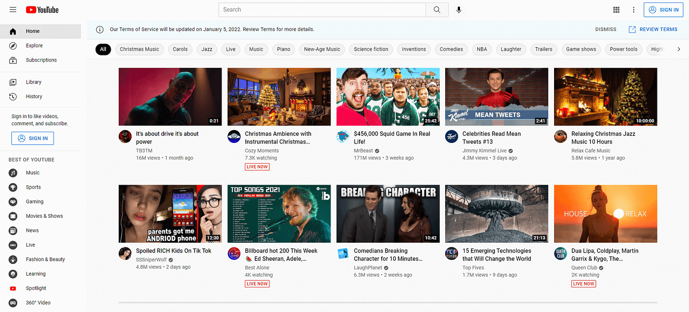
You might also want to consider grouping similar elements. For example, YouTube puts its video content in the center, while all navigational elements remain on the left-hand side:
If you want to go beyond these steps, consider taking a web design course. Even if you learn just a few additional tips, they might be able to help elevate your site.
7. Make sure your content is ‘skimmable’
The internet provides people with quick access to limitless amounts of information. However, one of the consequences is that people expect quick results. They may not want to take the time to read a full article. Thus, ‘skimmable’ content is key to satisfying visitors.
Fortunately, you don’t have to limit your content to do this. Even just a few formatting changes can make a big difference. For example, bullet points and numbered lists can help you quickly summarize key elements.
Another approach is to provide an article summary near the bottom or top of the page. This is especially important if your article is trying to answer a question. Users can always read the body of the content for more detailed information.
We also recommend that you provide header links near the top of your page or post. That way, users can access exactly what they’re looking for right away:

Finally, we recommend writing detailed headings as well. Clear titles can quickly communicate the topics on a page, and let readers know what to expect. Headers are also an opportunity to include relevant terms without resorting to keyword stuffing.
8. Be careful with your ads
Let’s finish up by talking about ads. Advertisements are an efficient way to monetize your work and increase your income. You don’t have to phase them out entirely, but we highly recommend that you use them with caution.
One way to improve the user experience is to limit ad space per page. If visitors have a hard time finding your content among all the advertisements, they can get frustrated.
Reserving white space can be an easy way to decrease the odds of this happening. Additionally, as in the example below, you can confine ads to one section of the screen:

We also recommend that you prioritize value-aligned partnerships. If your ads are poorly placed, they could take users to sites they don’t want to visit. Therefore, ensuring that you only work with quality brands can go a long way towards maintaining trust.
You might also want to avoid pop-up ads. While some sites still use these heavily, they’ve gained a bad reputation over the years. That’s because they interrupt visitors as they navigate your site. Thus, it might be best to choose other ad locations, or at least use pop-ups minimally.
If you’re ever in doubt, remember that ads aren’t the only way to support your site. There are other methods to monetize your work and maintain a high-quality user experience.
Improve your website’s user experience in 2023
Let’s be honest; creating a high-quality WordPress website isn’t easy. It’s an art that takes time, resources, and practice to perfect. Fortunately, following a few key strategies can go a long way to improving the user experience on your site.
In this article, we covered eight ways to enhance your visitors’ journeys:
- Consider a visual approach.
- Make sure that your site is responsive on all devices.
- Implement accessibility features.
- Track your user experience metrics.
- Use a marketing funnel.
- Keep each page’s design flow in mind.
- Make sure your content is ‘skimmable’.
- Be careful with your ads.
If you want some help, you can also consider hiring a website usability expert to make sure your site is easy for visitors to browse.
Do you still have any questions about how to improve user experience on your website? Let us know in the comments!


Or start the conversation in our Facebook group for WordPress professionals. Find answers, share tips, and get help from other WordPress experts. Join now (it’s free)!